Art & Decor Trends
Art World News
overstockArt.com
Uncategorized
Pantone Color of the Year 2022: Very Peri
Every year the company Pantone, who creates and trademarks colors for national brands, showcases a color of the year. This color is usually chosen to reflect what they think is the world view at that time. That color is then used in a number of ways, including interior decorating. They choose it based on both its beauty and popularity, as well as its meaning. This year the color they chose is Very Peri, a soft periwinkle purple.
For this year, they wanted to choose a color that reflected both confidence and curiosity. As the world is rapidly changing, this color offers a new perspective by combining the cool trusting qualities of blue with the energy of red undertones. Giving us the best of both worlds combined. They view it as a color that will encourage bravery and imagination; those are both things that the world could use more of in our life.
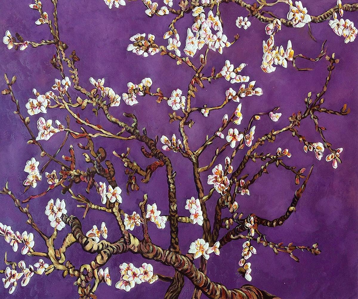
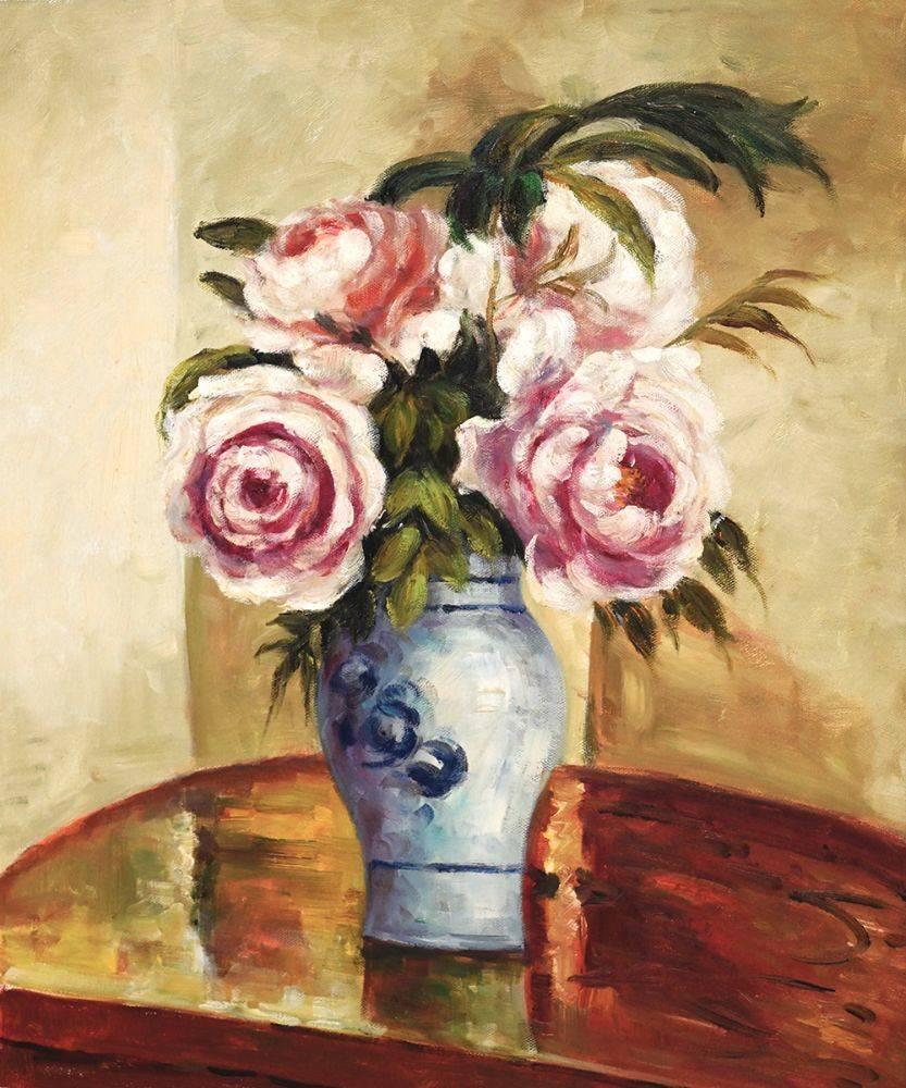
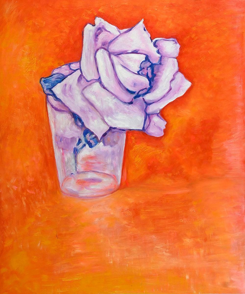
If you find inspiration in this new color, we have picked a few art pieces that we think would complement the Very Peri color and bring some of those qualities into your home. A darker purple such as the one in the Branches of an Almond Tree in Blossom Amethyst would make the room feel bold. Softer tones, closer to the periwinkle shade are found in White Rose in a Glass. If you are not a fan of still life and prefer people in the scene, Boreas makes good use of the color in the woman’s scarf. Artist’s Garden at Giverny offers a hint of the purple hue in a lovely landscape as well.
These are just a few suggested pieces, but there are many more to discover. We here at overstockArt hope that this new color of the year brings a fresh feeling to your home.
